Introduction
Voting infographics have emerged as vital tools in the modern electoral landscape. They transform dense information into engaging visuals that resonate with diverse audiences. These infographics not only simplify complex election data but also empower citizens by enhancing their understanding of voting rights and processes. However, as the digital age reshapes communication, a pressing question arises: how can organizations ensure these visual aids effectively boost voter engagement and participation? This inquiry is crucial as it lays the groundwork for exploring innovative strategies that can enhance democratic involvement.
Define Voting Infographic
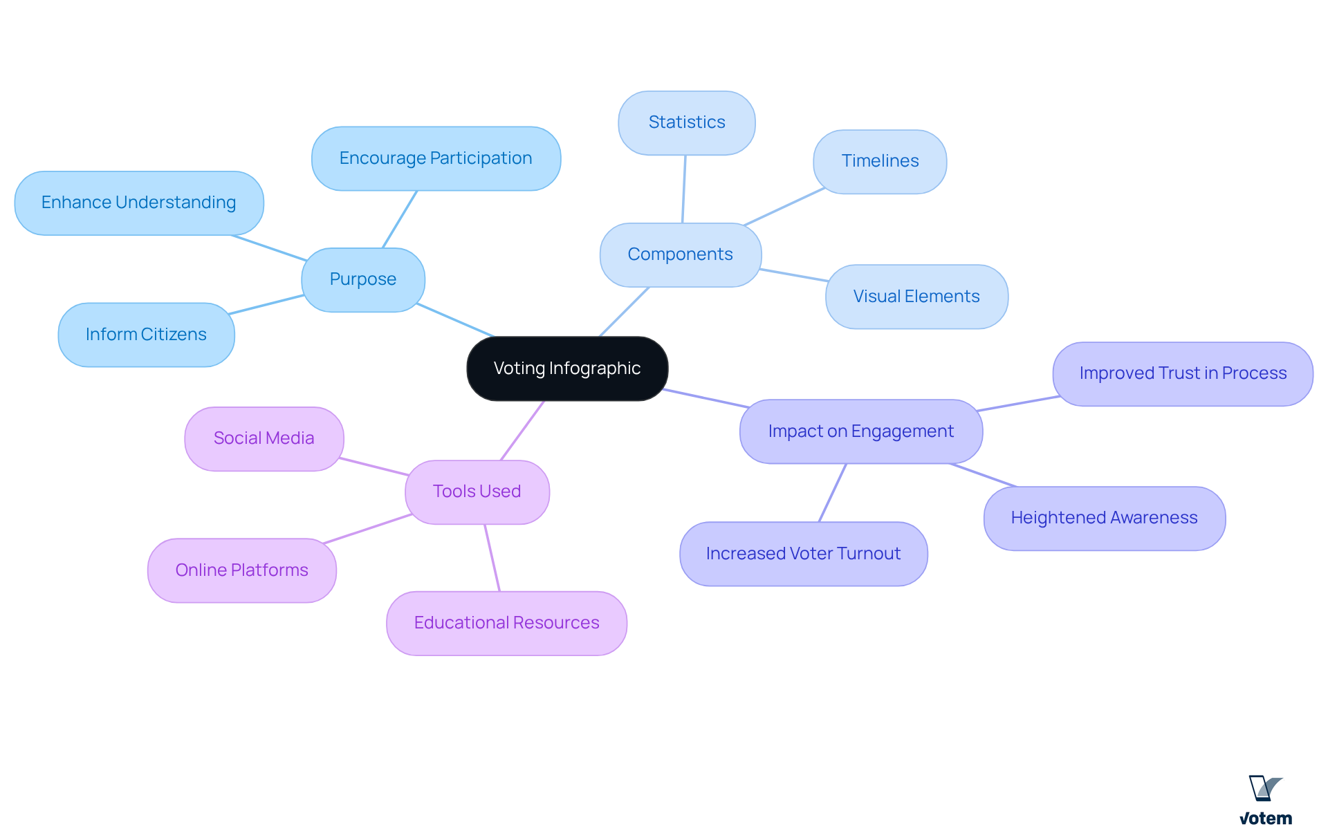
A voting infographic serves as a powerful graphical resource designed to convey essential information about the electoral process, election statistics, and avenues for citizen participation. These visual representations often integrate statistics, timelines, and graphical elements that simplify complex information into easily digestible formats, thereby broadening accessibility to a wider audience. By employing graphic narratives, election infographics not only inform citizens about their rights but also underscore the importance of involvement and elucidate the mechanics of the electoral process. This multifaceted approach enhances participant understanding and significantly boosts engagement levels.
For instance, initiatives like the Asian Network at Yale’s infographic aimed at increasing engagement in Connecticut’s Presidential Preference Primary effectively raised awareness regarding electoral participation. This case illustrates the profound impact that meticulously designed can have on voter turnout. Research indicates that the use of a voting infographic can lead to heightened engagement metrics, positioning data visualizations as vital tools in contemporary electoral strategies.
Moreover, Votem’s CastIron platform enhances this educational initiative by providing a secure and accessible online ballot experience. This ensures transparency and verifiability, fostering trust and confidence in the electoral process. As we consider these advancements, the integration of compelling visual resources will undoubtedly play a crucial role in shaping informed and active citizen participation.

Contextualize the Importance of Voting Infographics
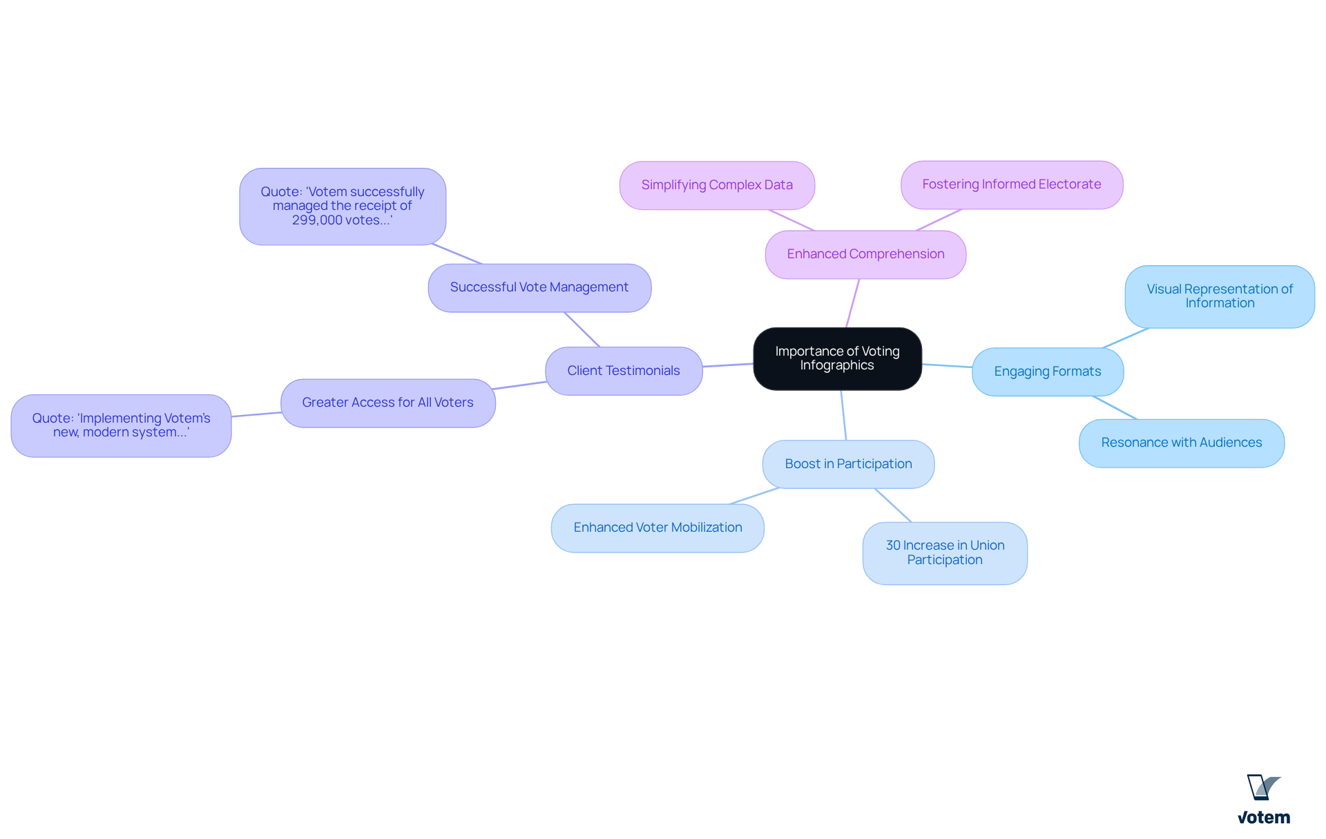
Voting infographics are essential in contemporary electoral processes, as they transform complex information into engaging formats that resonate with audiences. In an era marked by limited attention spans, a voting infographic effectively conveys critical messages about voting rights, deadlines, and procedures. For labor unions, visual representations serve as catalysts for mobilizing members, ensuring they are well-informed about upcoming elections and the significance of their participation.
Studies indicate that organizations employing a voting infographic may experience a significant [boost in electoral participation](https://brennancenter.org/our-work/research-reports/growing-racial-disparities-voter-turnout-2008-2022). For instance, unions that adopted visual communication methods reported up to a 30% increase in member involvement during elections. Testimonials from satisfied clients further underscore the effectiveness of Votem’s solutions in this area. One client remarked, “Implementing Votem’s new, modern system which allowed greater access for all qualified voters—from military voters to voters with disabilities—was my greatest accomplishment in office.”
Furthermore, Votem’s capacity to manage substantial ballot volumes is emphasized by another client who stated, “Votem successfully managed the receipt of 299,000 votes on behalf of the National Radio Hall of Fame, an increase over last year’s 126,000 votes received.” By simplifying complex data and displaying it visually, a voting infographic not only enhances comprehension but also fosters a more engaged and informed electorate, ultimately contributing to a healthier democratic process.

Trace the Evolution of Voting Infographics
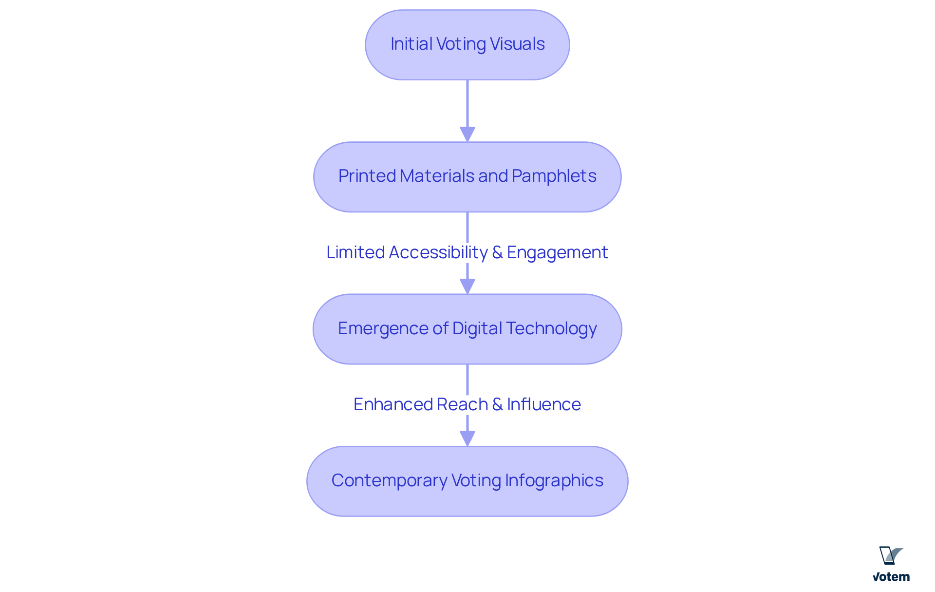
The evolution of voting visuals underscores the urgent necessity for effective electorate education in an increasingly complex political environment. Initially, information dissemination was confined to printed materials and pamphlets, which limited both accessibility and engagement. However, the advent of digital technology and social media has transformed the landscape of information sharing. Today, a serves as a powerful example of how visual data representations are extensively circulated online, significantly amplifying their reach and influence. Organizations, including labor unions, have adopted these digital tools like a voting infographic to convey crucial election information to their members in a visually appealing and easily digestible format. This shift not only enhances understanding but also fosters greater participation in the electoral process, as evidenced by increased turnout at events that utilize these contemporary communication strategies.

Identify Key Characteristics of Effective Voting Infographics
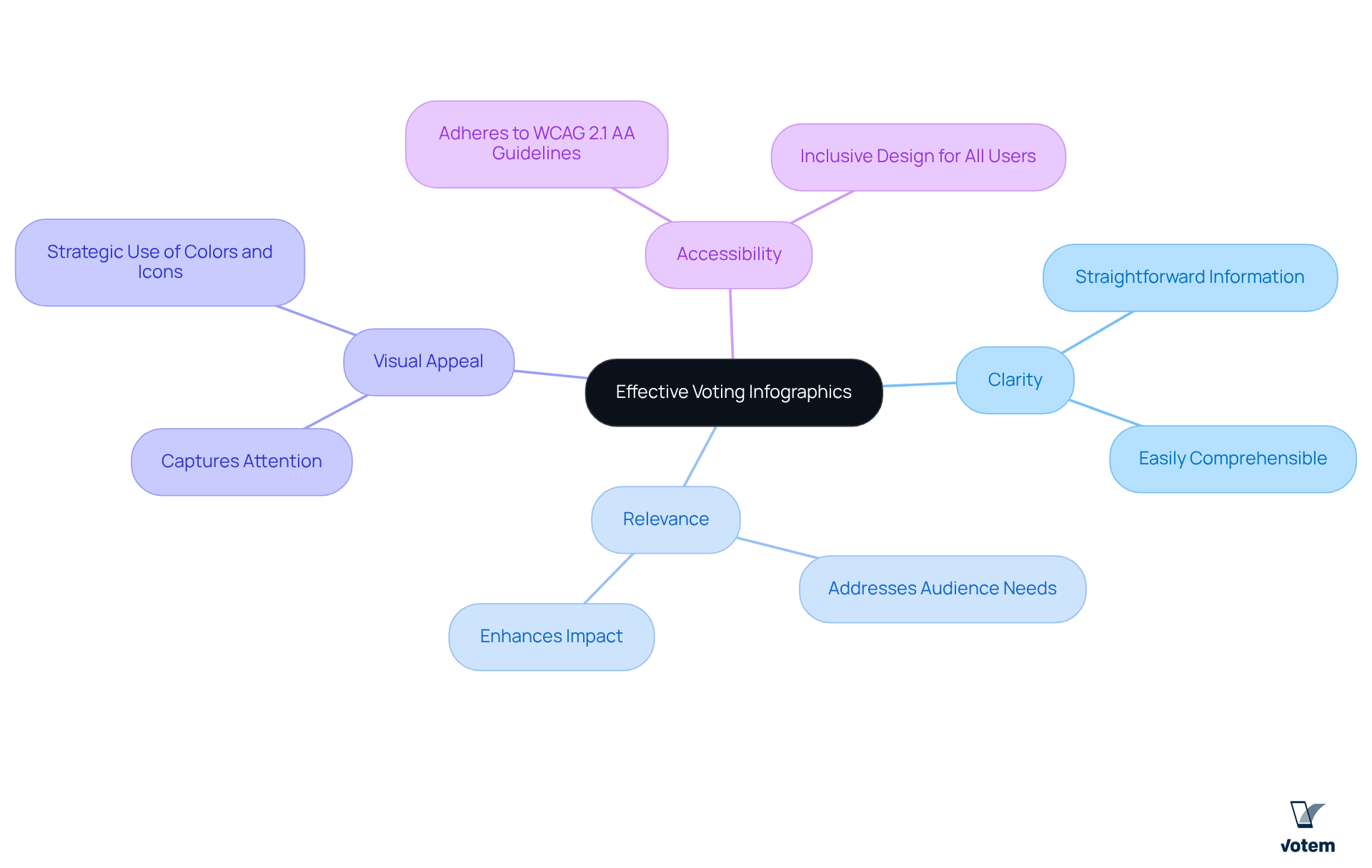
Effective voting infographics incorporate several critical characteristics: clarity, relevance, visual appeal, and accessibility. Clarity is paramount; it ensures that information is straightforward and easily comprehensible. Relevance guarantees that the content addresses the specific needs and interests of the target audience, thereby enhancing its impact. Visual appeal plays a significant role in capturing attention and fostering engagement, often achieved through the strategic use of colors, icons, and charts. Accessibility is equally essential; infographics must adhere to guidelines like WCAG 2.1 AA to ensure inclusivity for everyone, including individuals with disabilities.
Research indicates that approximately 38.3 million eligible participants in the U.S. had a disability in 2020, underscoring the necessity for accessible design. Votem’s exemplify this commitment. For instance, testimonials from clients highlight significant increases in participation, such as the National Radio Hall of Fame’s remarkable jump from 126,000 to 299,000 votes. By integrating these elements, organizations can create a voting infographic that not only informs but also motivates action among voters. Ultimately, this approach contributes to higher participation rates in elections, demonstrating the power of effective design in the electoral process.

Conclusion
Voting infographics serve as a pivotal mechanism for enhancing civic engagement and rendering the electoral process more accessible. By transforming complex information into visually appealing formats, these tools empower citizens to grasp their voting rights and responsibilities, ultimately nurturing a more informed electorate. Effective design principles ensure that these infographics not only capture attention but also inspire action, reinforcing the imperative of participation in democratic processes.
The article underscores key arguments emphasizing the importance of clarity, relevance, and accessibility in the design of voting infographics. The evolution of these visual tools, driven by advancements in digital technology, highlights their increasing significance in mobilizing voters and augmenting participation rates. Real-world examples, including the successes reported by organizations utilizing infographics, further affirm their efficacy in driving voter turnout and engagement.
In a landscape where informed participation is crucial for a robust democracy, harnessing the power of voting infographics is indispensable. By adopting these innovative communication strategies, organizations can substantially enhance voter education and involvement. As the call for heightened civic participation persists, the integration of compelling visual resources stands as a testament to the transformative potential of effective design in cultivating an engaged and active citizenry.
Frequently Asked Questions
What is a voting infographic?
A voting infographic is a graphical resource designed to convey essential information about the electoral process, election statistics, and ways for citizens to participate. It simplifies complex information into easily digestible formats using statistics, timelines, and graphical elements.
How do voting infographics enhance citizen engagement?
Voting infographics enhance citizen engagement by informing individuals about their rights, emphasizing the importance of participation, and clarifying the mechanics of the electoral process. This multifaceted approach significantly boosts understanding and engagement levels among voters.
Can you provide an example of a successful voting infographic initiative?
Yes, the Asian Network at Yale created an infographic aimed at increasing engagement in Connecticut’s Presidential Preference Primary, which effectively raised awareness about electoral participation and demonstrated the impact of well-designed graphical representations on voter turnout.
What benefits do voting infographics provide in contemporary electoral strategies?
Research indicates that voting infographics can lead to heightened engagement metrics, making them vital tools in contemporary electoral strategies by improving voter understanding and participation.
How does Votem’s CastIron platform contribute to the electoral process?
Votem’s CastIron platform enhances the electoral process by providing a secure and accessible online ballot experience, ensuring transparency and verifiability, which fosters trust and confidence among voters.
What role do visual resources play in shaping citizen participation?
Compelling visual resources, such as voting infographics, play a crucial role in shaping informed and active citizen participation by making complex electoral information more accessible and engaging.
List of Sources
- Define Voting Infographic
- cisa.gov (https://cisa.gov/resources-tools/resources/three-ps-voting-0)
- constitutioncenter.org (https://constitutioncenter.org/education/constitution-101-curriculum/13-voting-rights-in-america)
- news.clemson.edu (https://news.clemson.edu/clemson-students-aim-to-increase-the-number-of-midterm-voters-on-campus)
- asiannetwork.yale.edu (https://asiannetwork.yale.edu/news/your-vote-matters-how-vote-infographic)
- Contextualize the Importance of Voting Infographics
- aapidata.com (https://aapidata.com/featured/2024-asian-american-voter-survey)
- Growing Racial Disparities in Voter Turnout, 2008–2022 (https://brennancenter.org/our-work/research-reports/growing-racial-disparities-voter-turnout-2008-2022)
- census.gov (https://census.gov/library/stories/2019/04/behind-2018-united-states-midterm-election-turnout.html)
- census.gov (https://census.gov/library/stories/2021/04/record-high-turnout-in-2020-general-election.html)
- countyhealthrankings.org (https://countyhealthrankings.org/findings-and-insights/2024-national-findings-report)
- Trace the Evolution of Voting Infographics
- pewresearch.org (https://pewresearch.org/journalism/2020/07/30/demographics-of-americans-who-get-most-of-their-political-news-from-social-media)
- projectvote.org (https://projectvote.org/?publication_type=infographic)
- Summary of the U.S. Presidential Election Process – U.S. Embassy & Consulate in Kazakhstan (https://kz.usembassy.gov/summary-of-the-u-s-presidential-election-process)
- osce.org (https://osce.org/odihr/elections/459967)
- Identify Key Characteristics of Effective Voting Infographics
- Voting accessibility | MIT Election Lab (https://electionlab.mit.edu/research/voting-accessibility)
- news.clemson.edu (https://news.clemson.edu/clemson-students-aim-to-increase-the-number-of-midterm-voters-on-campus)
- researchgate.net (https://researchgate.net/publication/221320378_Implications_of_Graphics_on_Usability_and_Accessibility_for_the_Voter)
- pbs.org (https://pbs.org/newshour/politics/report-finds-people-with-disabilities-continue-to-face-outsized-barriers-to-voting)
- today.umd.edu (https://today.umd.edu/chart-a-course-for-registering-voting-this-election-season)

